About
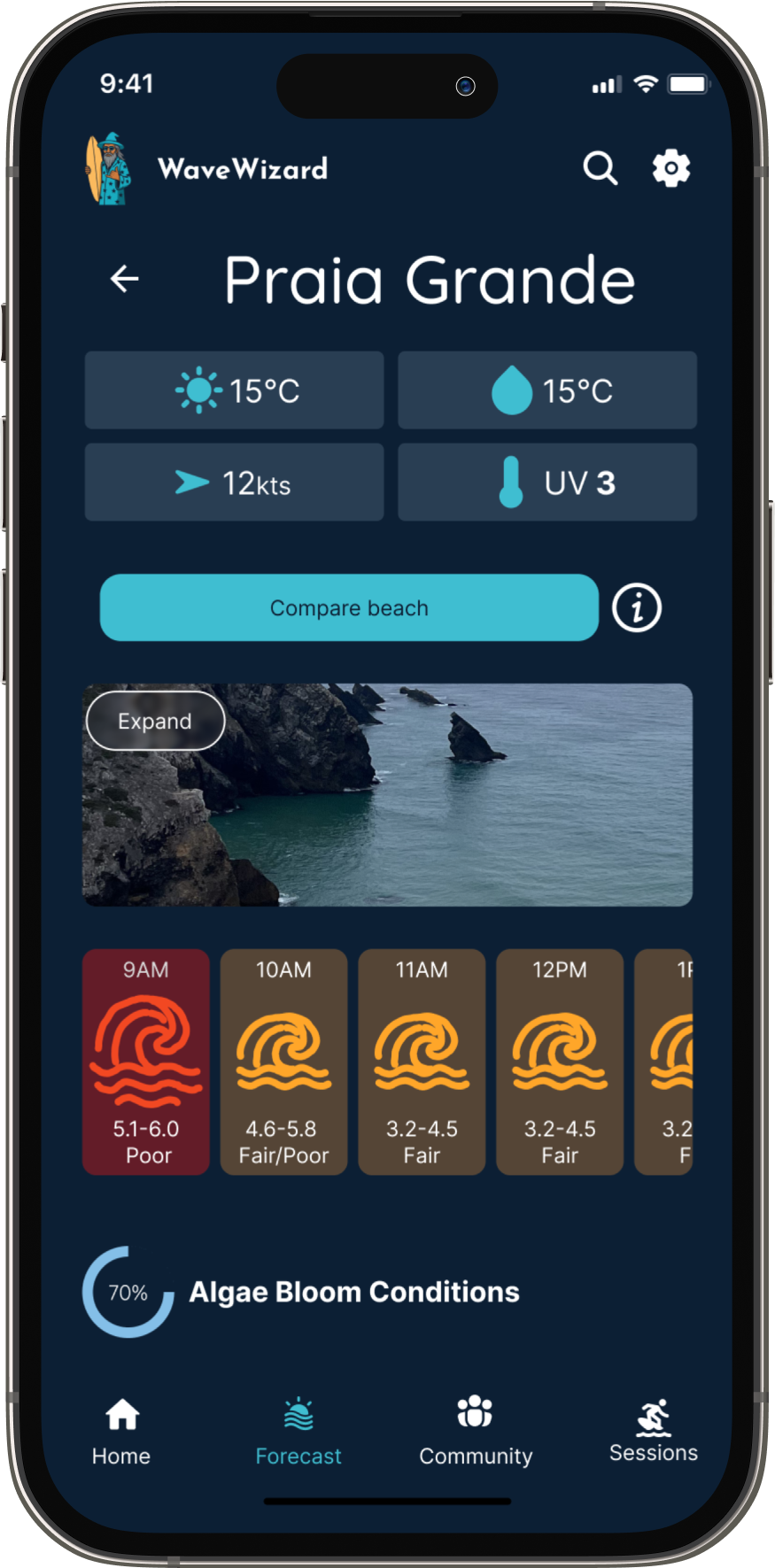
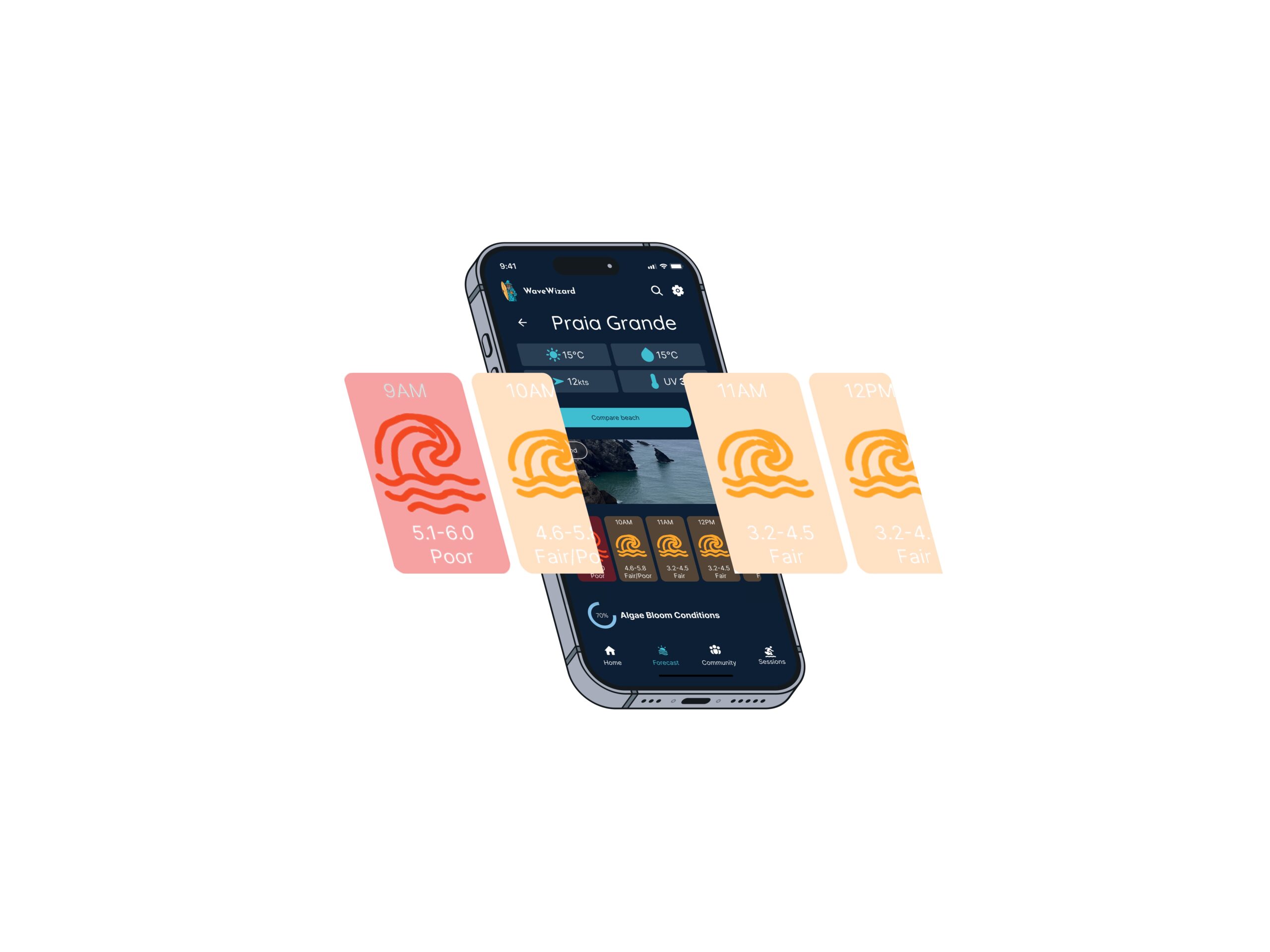
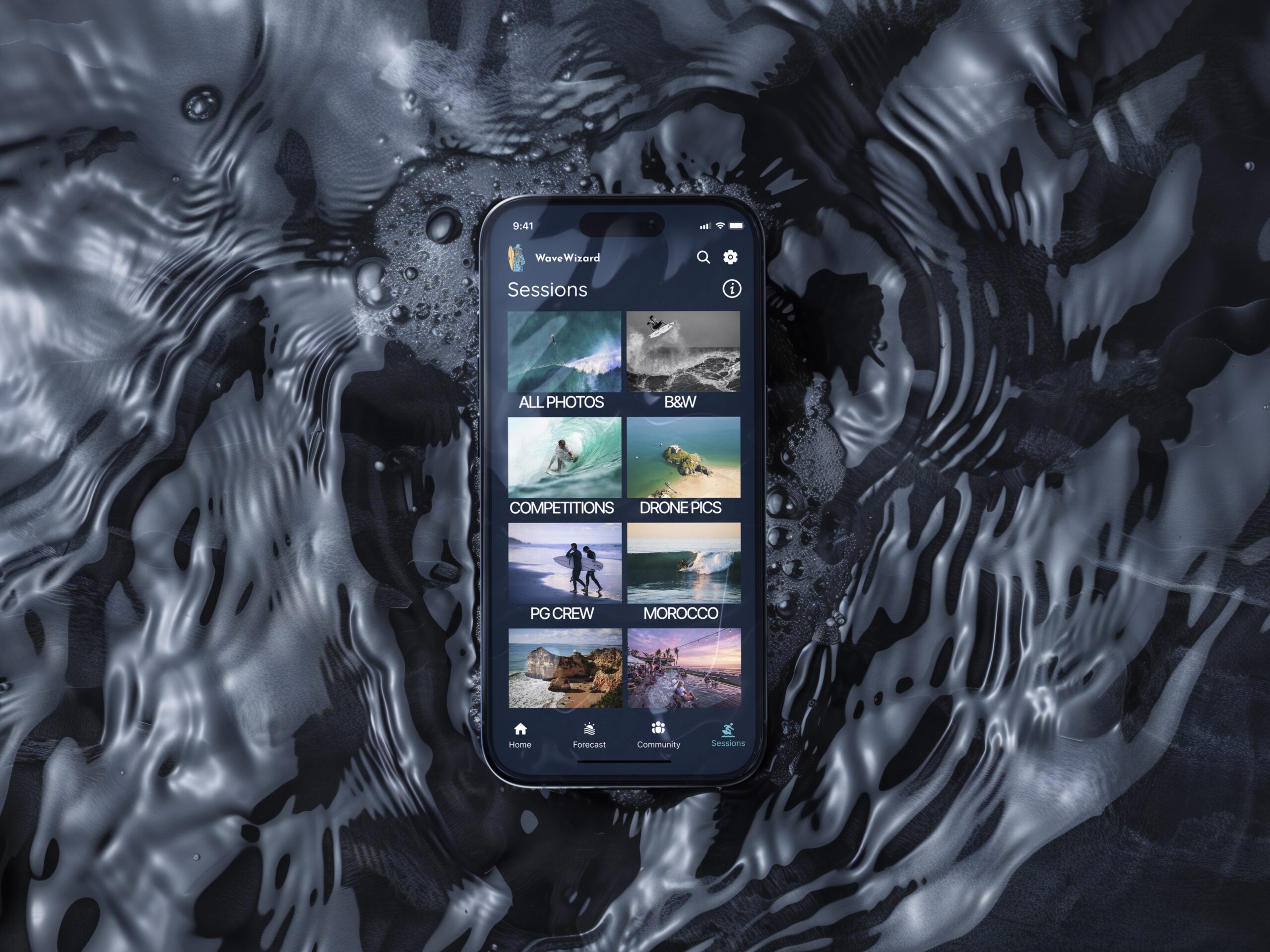
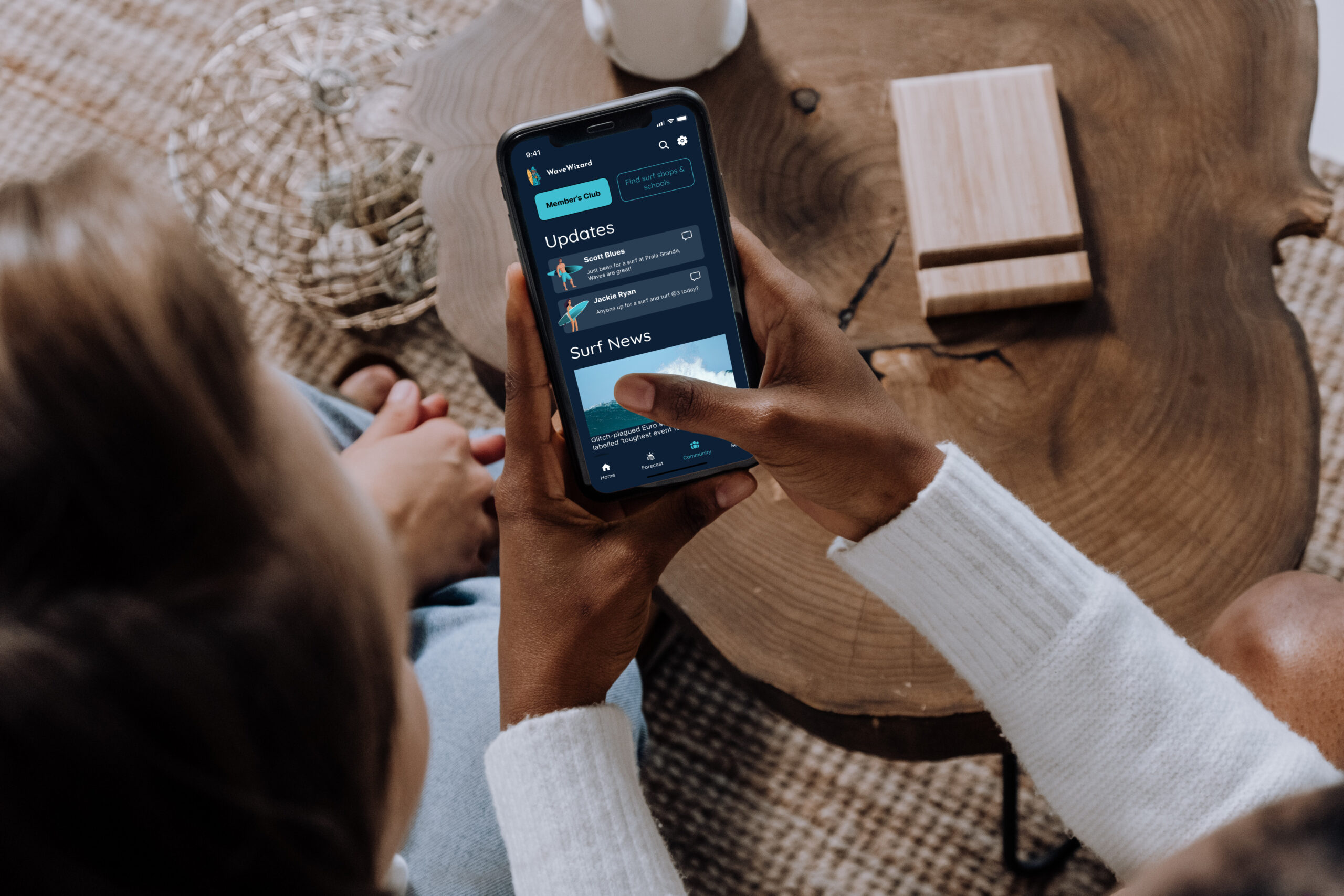
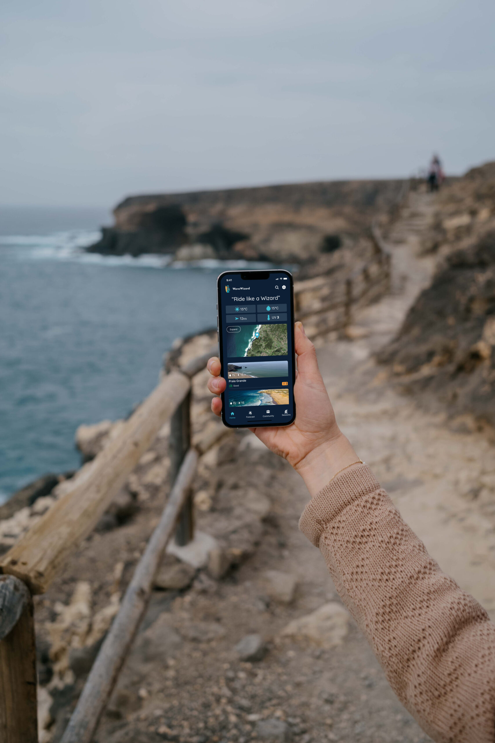
Wave Wizard is a purpose-built mobile application for surfers—whether seasoned or just starting out—that delivers real-time and forecasted wind, wave, and weather data through a beautifully intuitive interface. Surfers need precise, accessible surf-condition data to stay safe and make the most out of every session. Existing apps can feel cluttered, overly technical, or lack a sense of surf-community. By emphasizing clarity, personalisation, and community, Wave Wizard bridges that gap, making surf insights feel approachable, engaging, and insightful for all skill levels.
Scale
Role
Company
16 Weeks
Product Designer
Part of my project for Career Foundry Product Design Course
Problem Statement
Many surf apps on the market present surf and weather forecasts in technical formats that are difficult for beginners to understand. They also seem to lack interesting features that could create a surfing community from within. Furthermore, surfers struggled to trust recommendations using metrics and could not easily source recommendations from locals. Beginner surfers especially felt overwhelmed by complex and data heavy interfaces, wanting a more engaging, beginner-friendly tool. used, collaborative, and time-efficient learning.
How Might We
How might we create an all inclusive app for sufers of all levels that does not negate imprirical surf data and metrics, that promotes a community feel and surf tracking to promote conitnual app usage?
Design Process
Discover

Competitive analsyis, User research & interviews
Define
User personas & flows, sitemaps, and card sorting
Ideate

Wire-framing & protoyping
Design

Design systems, designing for accessibility, and UX/UI iterations
Discover
Competitive Analysis
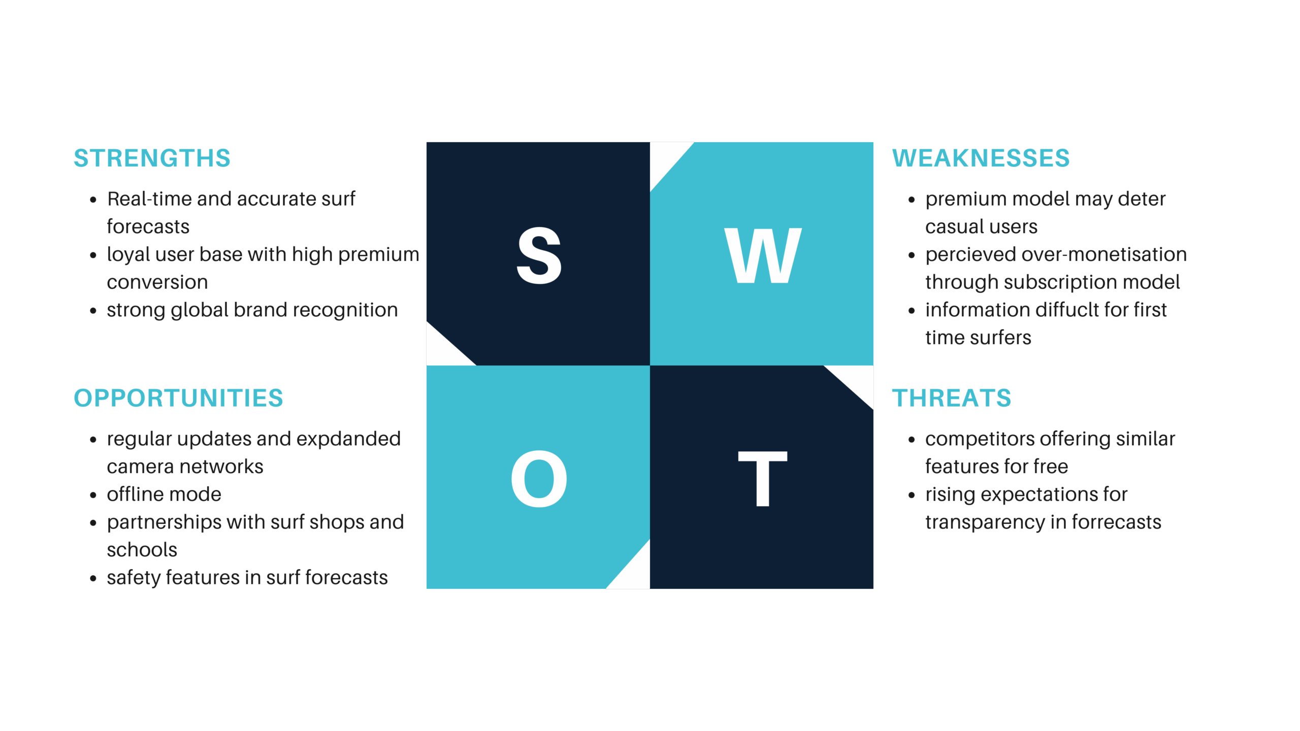
To understand the competitive landscape, I conducted a SWOT analysis, a UX analysis, and a competitive profiling of surf apps including MagicSeaweed, Surfline, Surf Forecast, and also broader weather platforms like iPhone weather, Windy and AccuWeather. This helped me uncover WaveWizard's unique value proposition within the market.
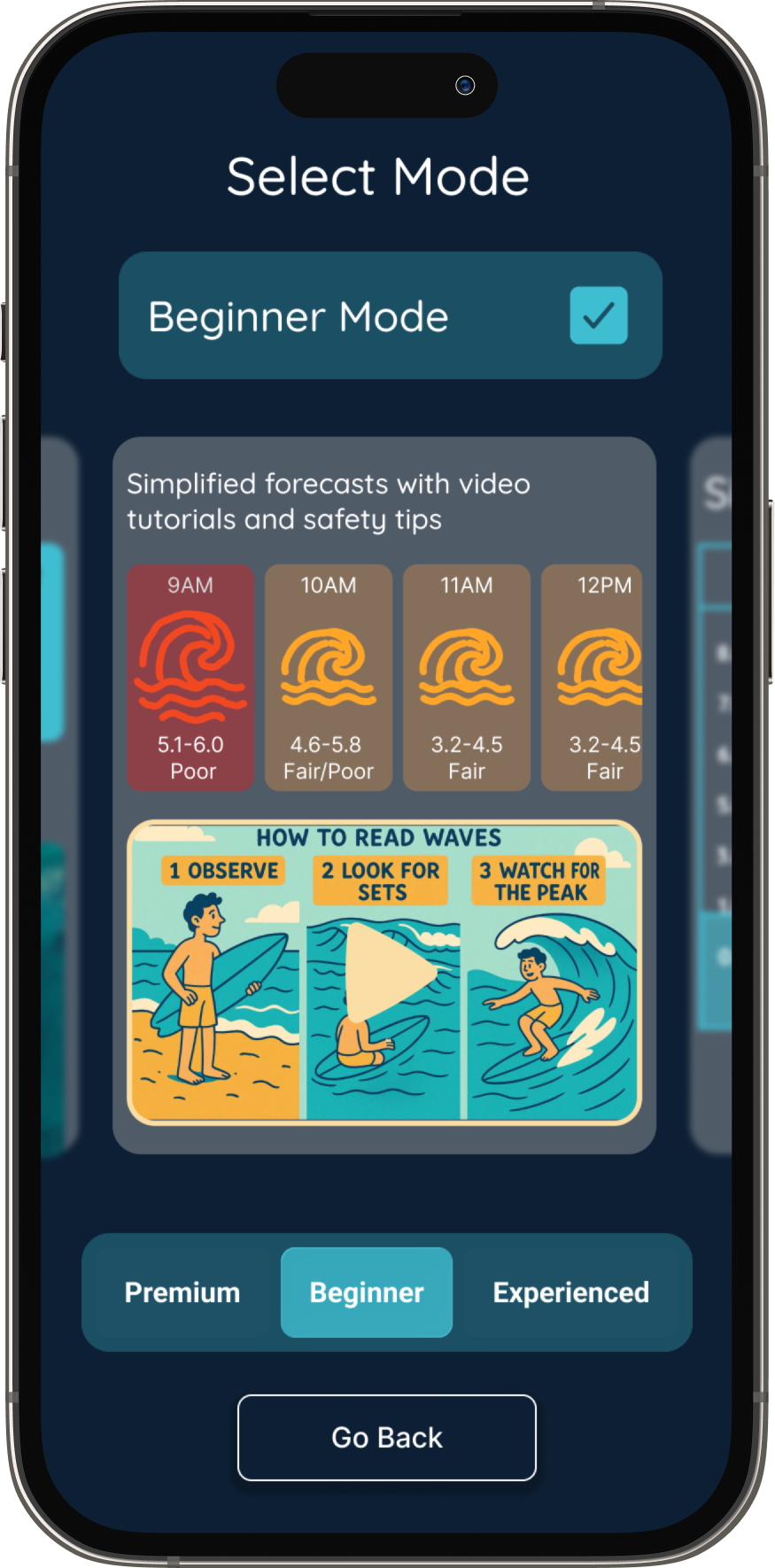
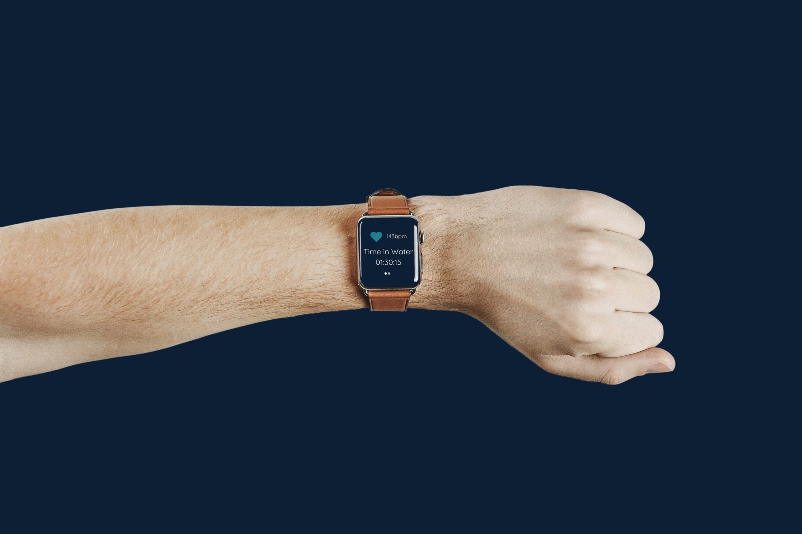
Added features that would stand out: beginner mode, session tracking, and high-contrast UI for outdoor readability
Discover
User interviews
I interviewed 6 surfers across varying levels of experience to explore their decision-making habits, challenges, and preferences when checking surf conditions.
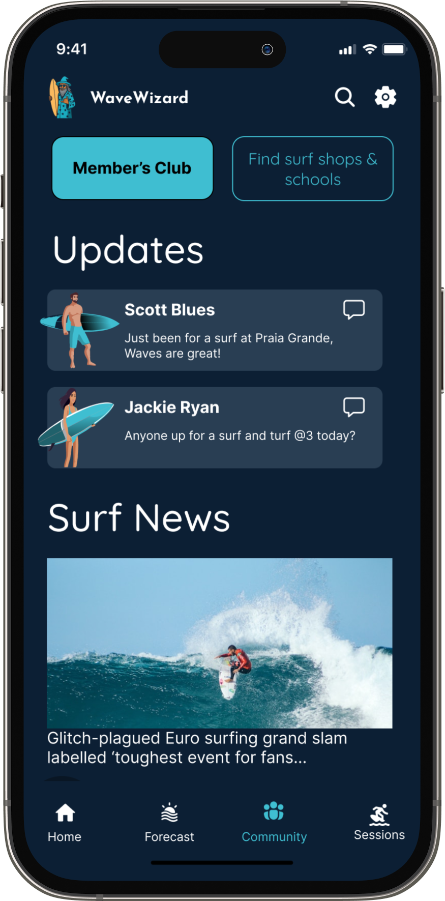
Users opt for apps with additional features that enhance their surf experience.
Many Users access weather apps in bright light.
Users find alerts and live updates paramount for safety
Define
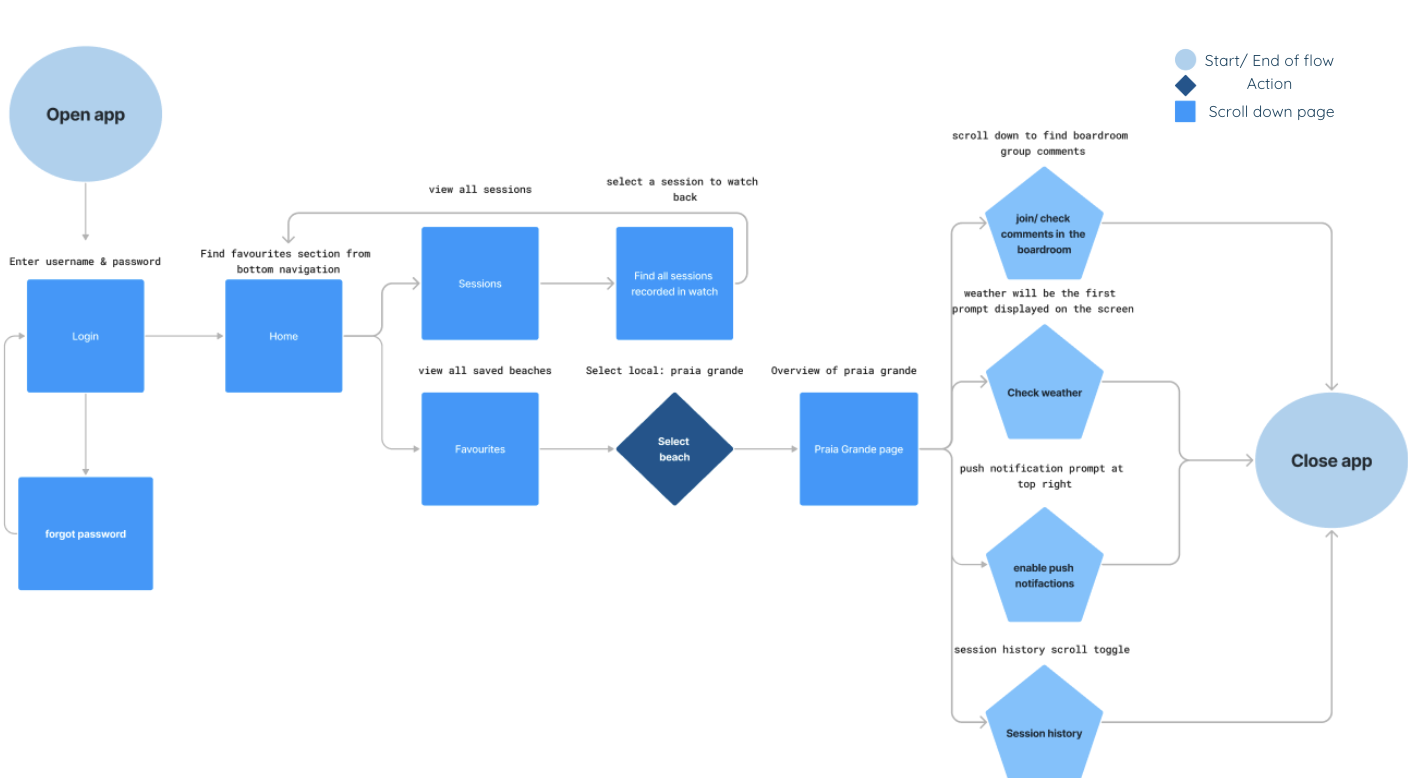
User Personas & flows
Personas were shaped by research findings to capture key user needs, behaviours, and pain points. These guided the app’s structure and essential features.
Ideate
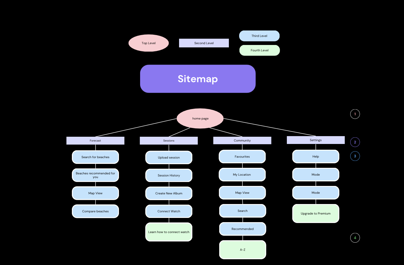
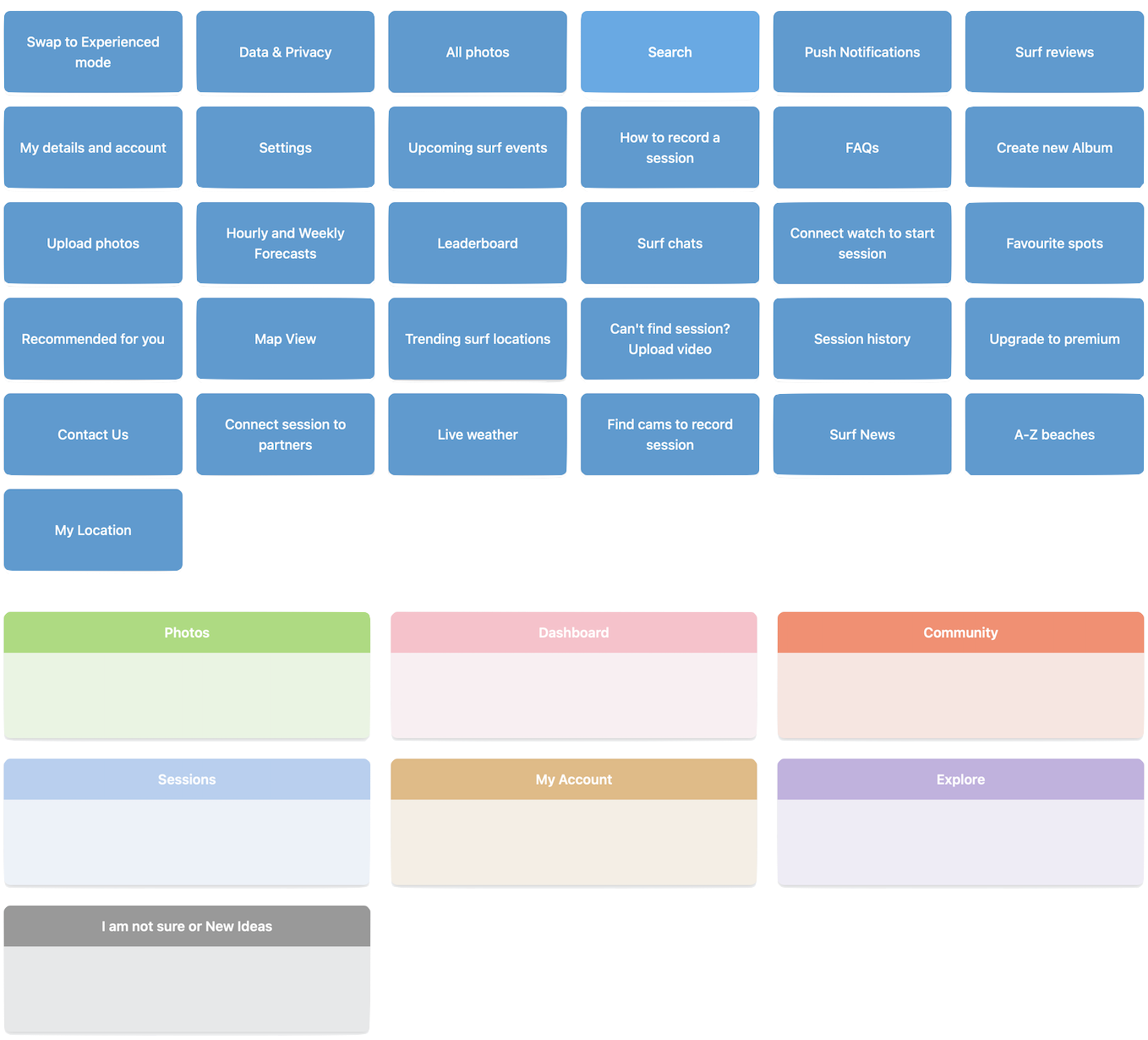
Card sorting & sitemaps
To structure navigation intuitively, I conducted a card sorting exercise with 8 participants. This helped to validate assumptions about surf-related terminology, and refine the app’s labelling and categorisation for both beginners and pros.
Design
Style Guide
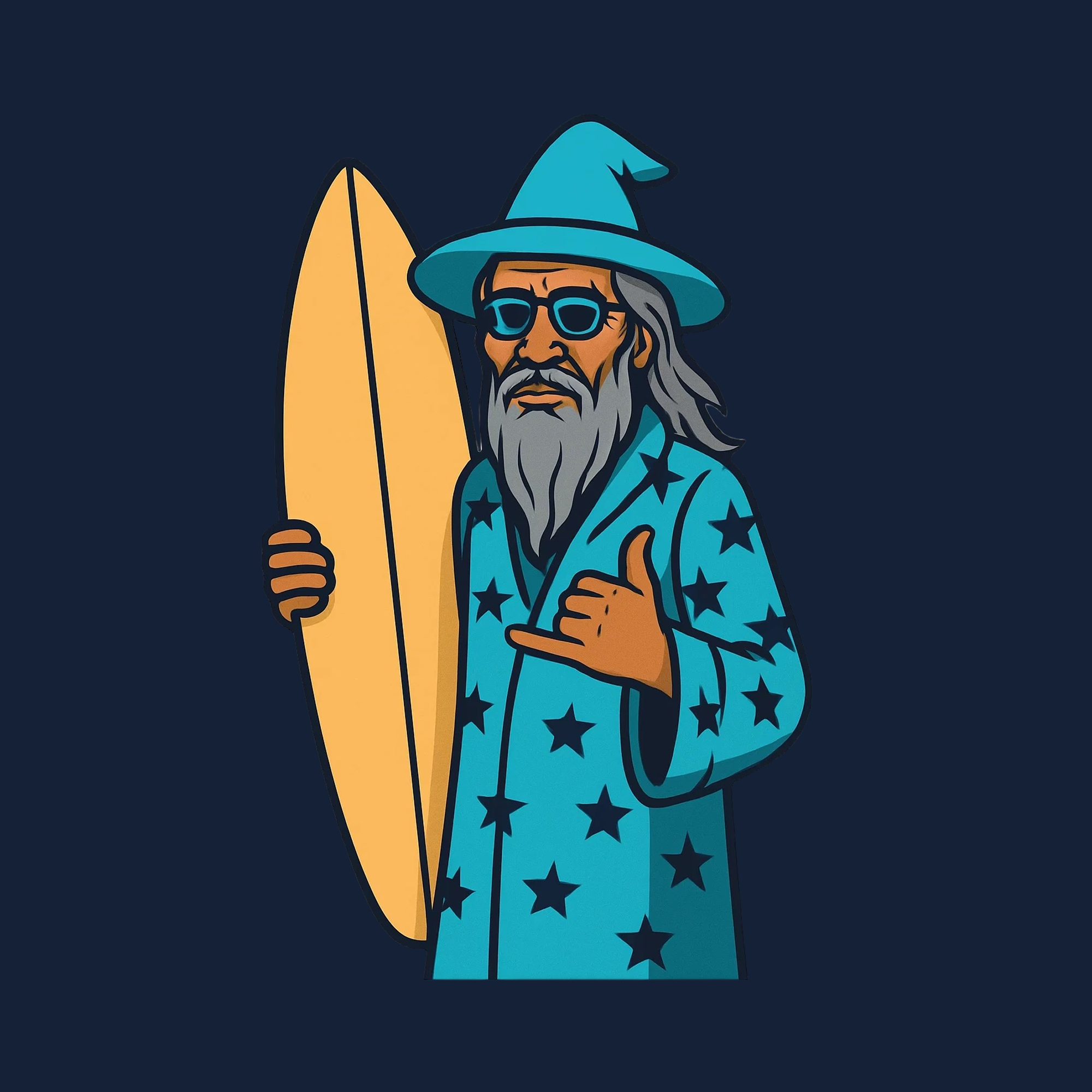
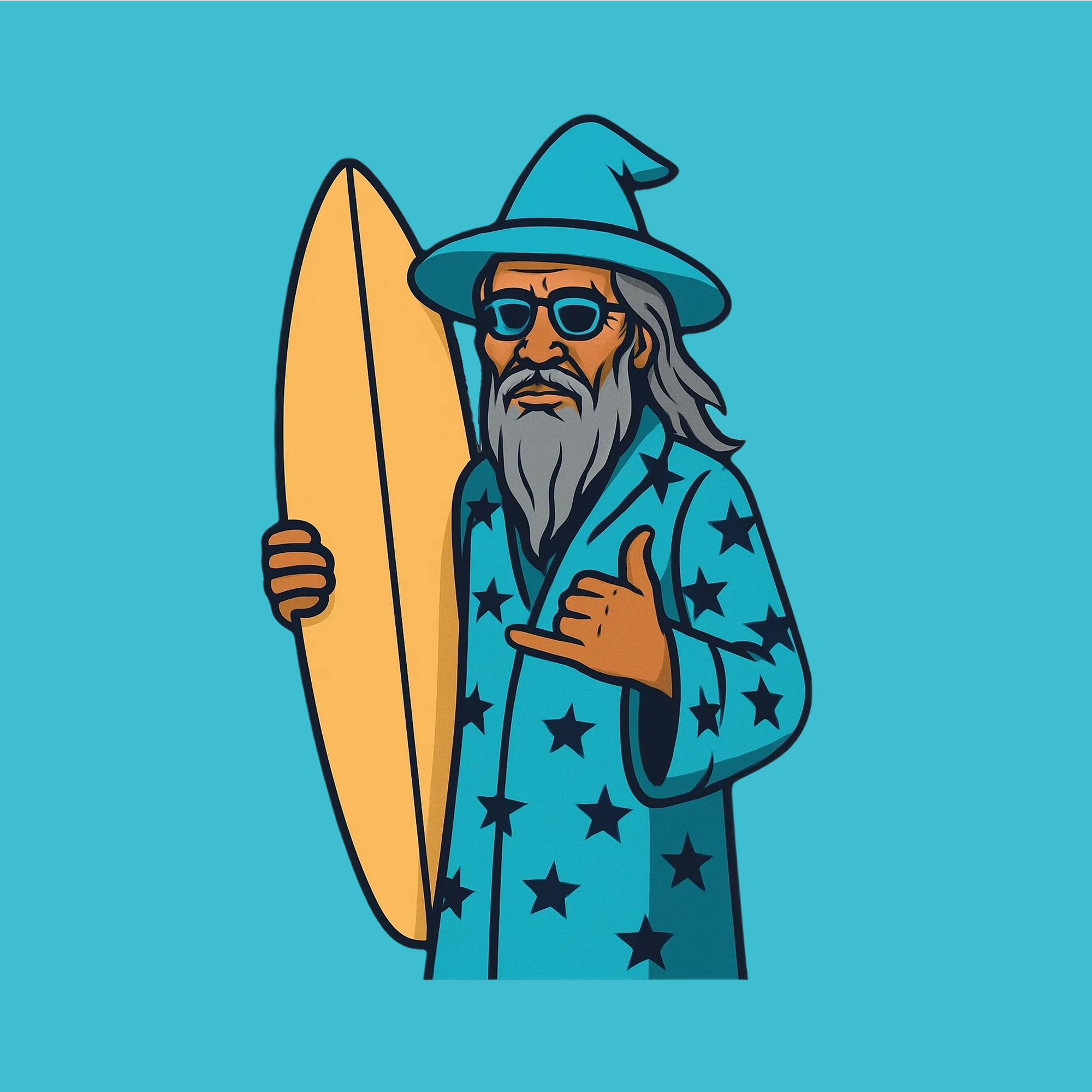
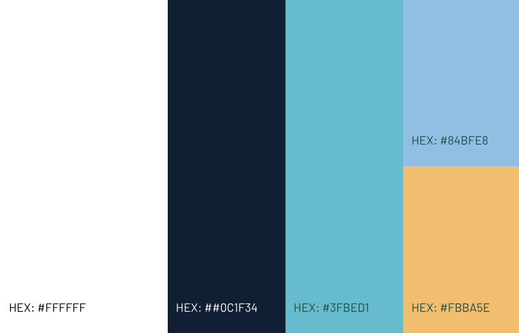
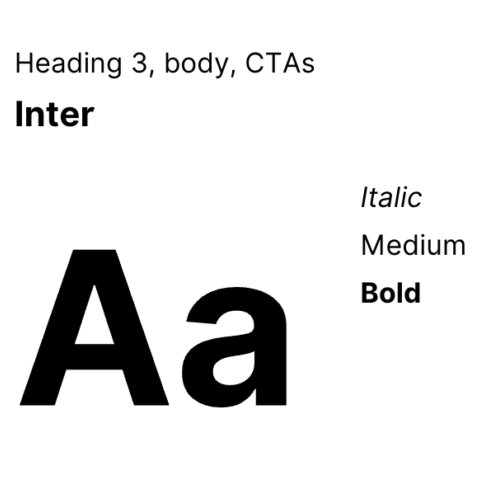
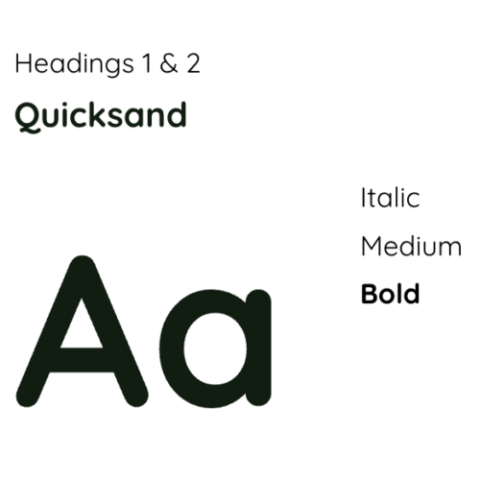
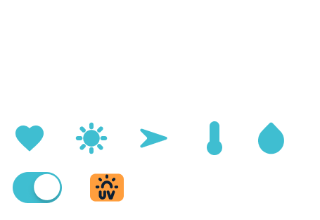
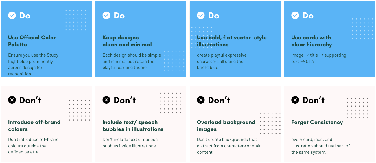
The style guide defines the brand identity across logo, colour palette, typography, and iconography. It ensures consistency and clarity across all platforms, with clear guidance on visual dos and don’ts.
Logo
Colours
Typography
Iconography and cards
Do's & Don'ts
Design
Accessibility
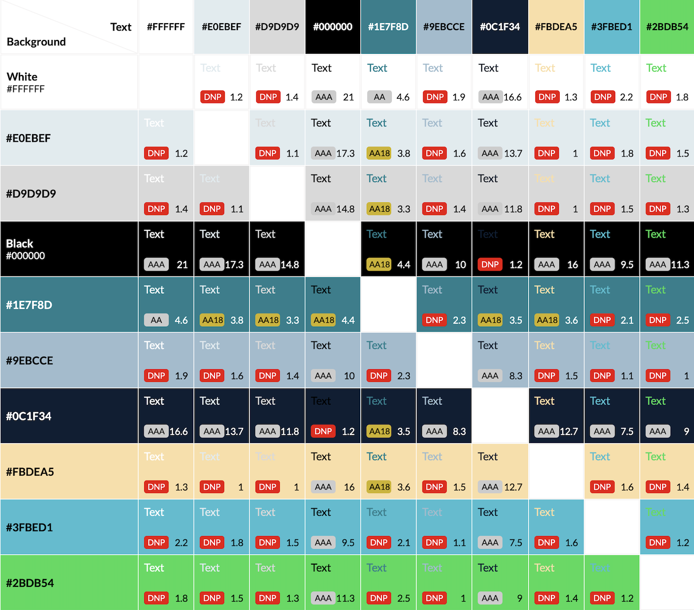
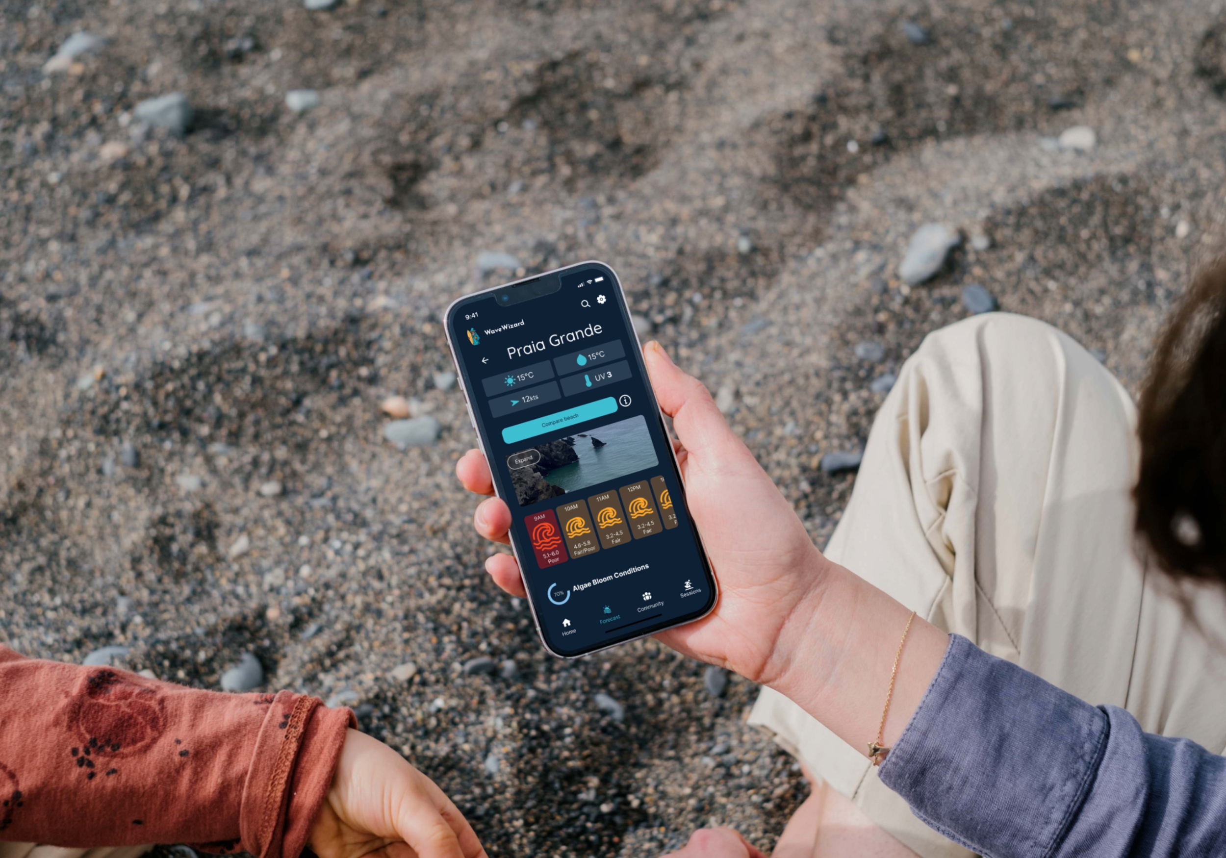
I created visual design concepts and iterated them consistently to include delightful animations, meet accessibility guidelines, and create a brand personality. I created a playful and approachable visual identity using ocean blue and sand yellow, evoking the beach environment while ensuring strong visual contrast.
Screen readers, alt text, and video transcripts for visual and hearing accessibility.
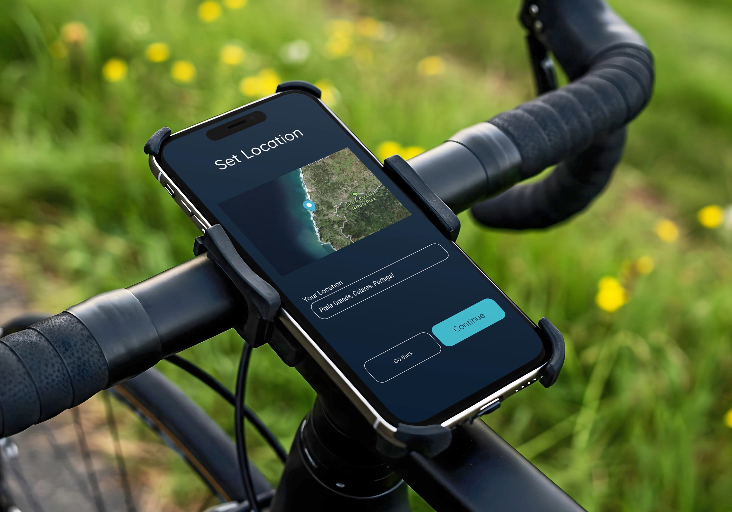
Final Design
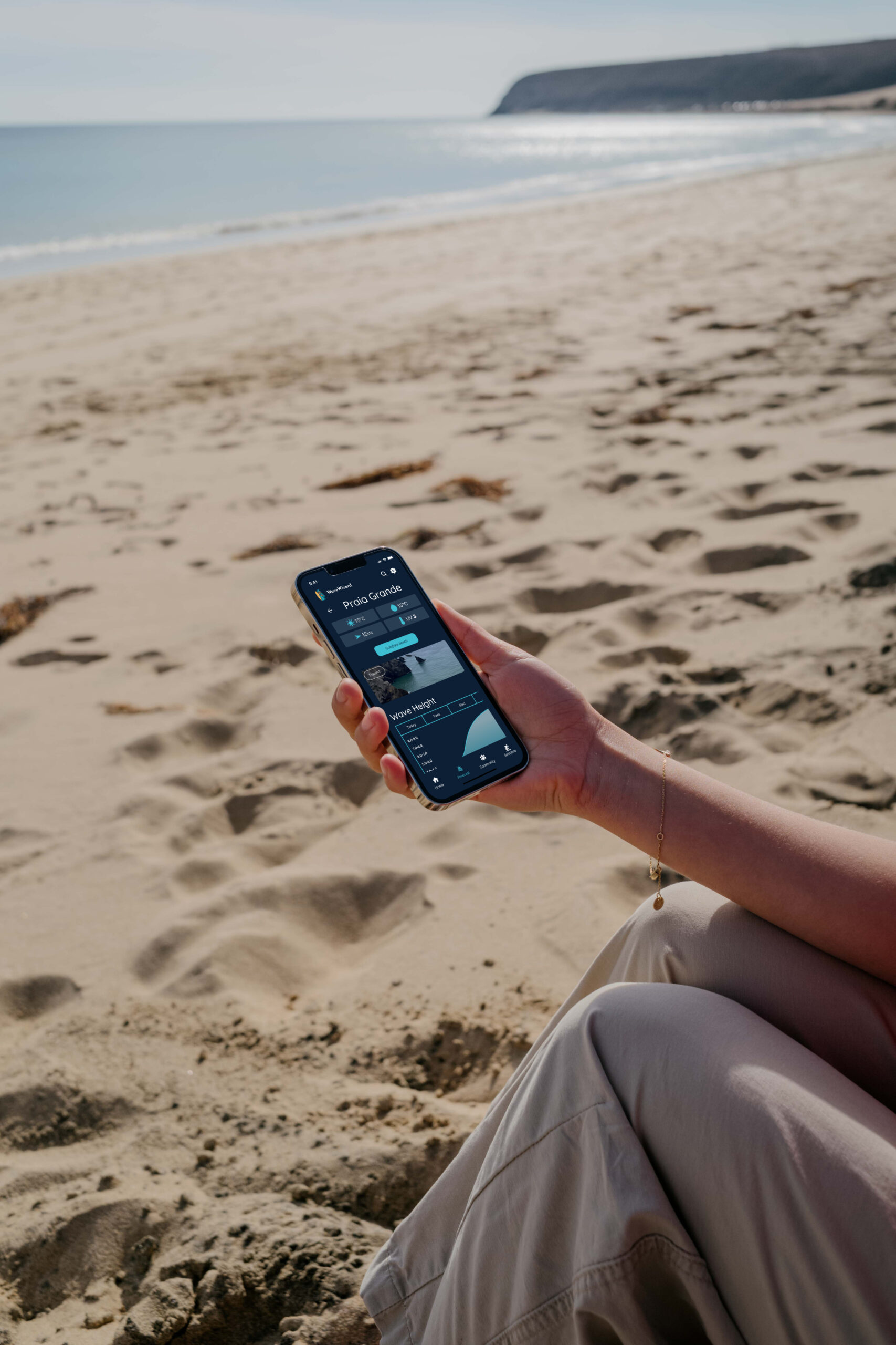
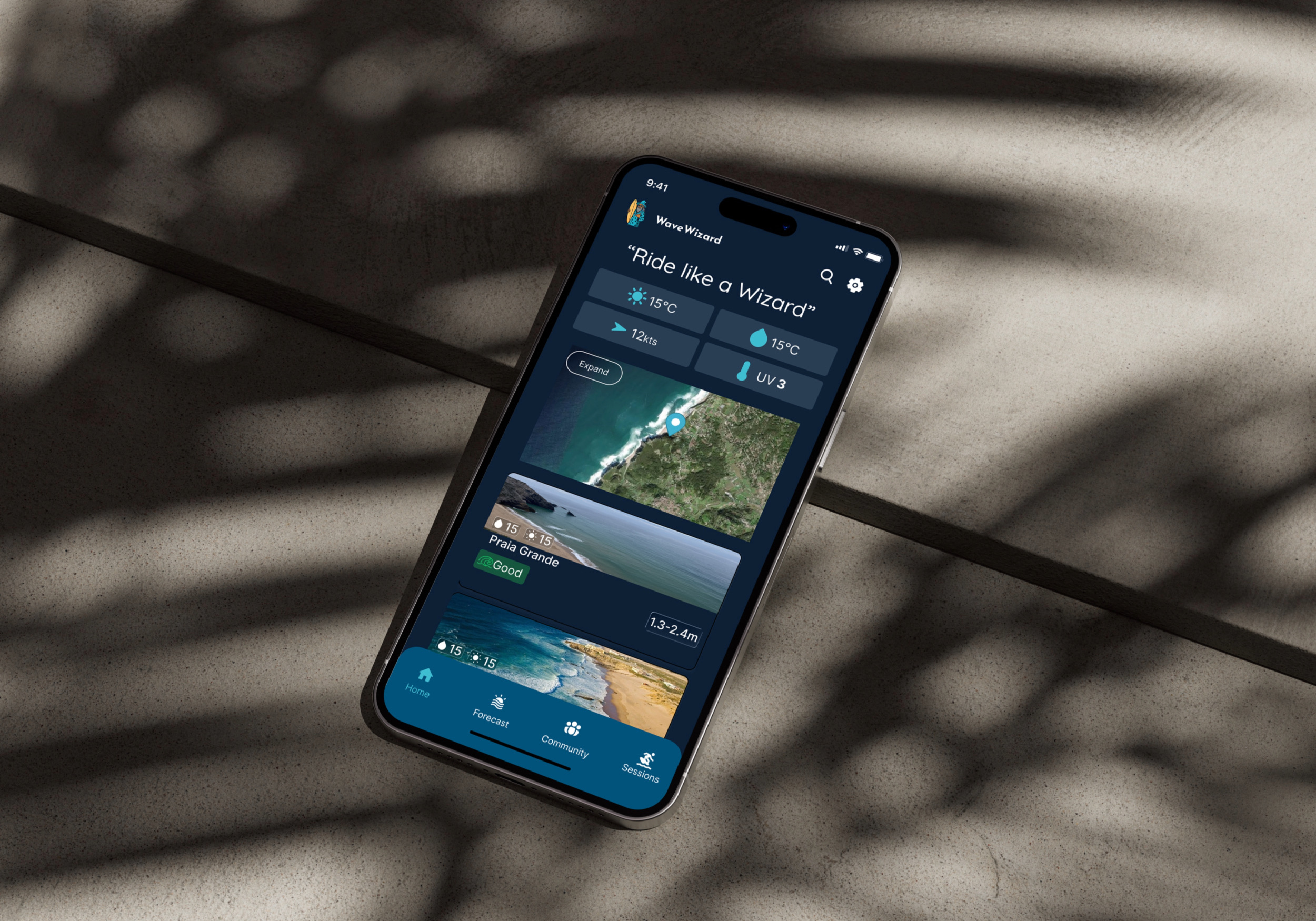
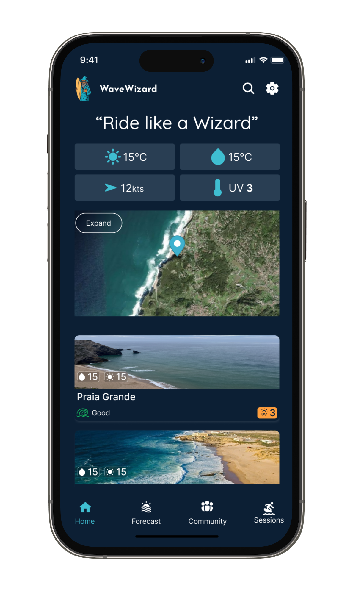
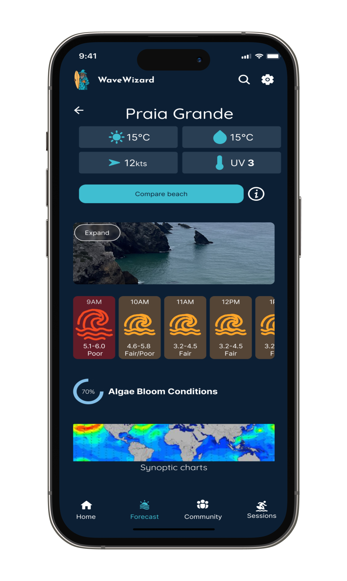
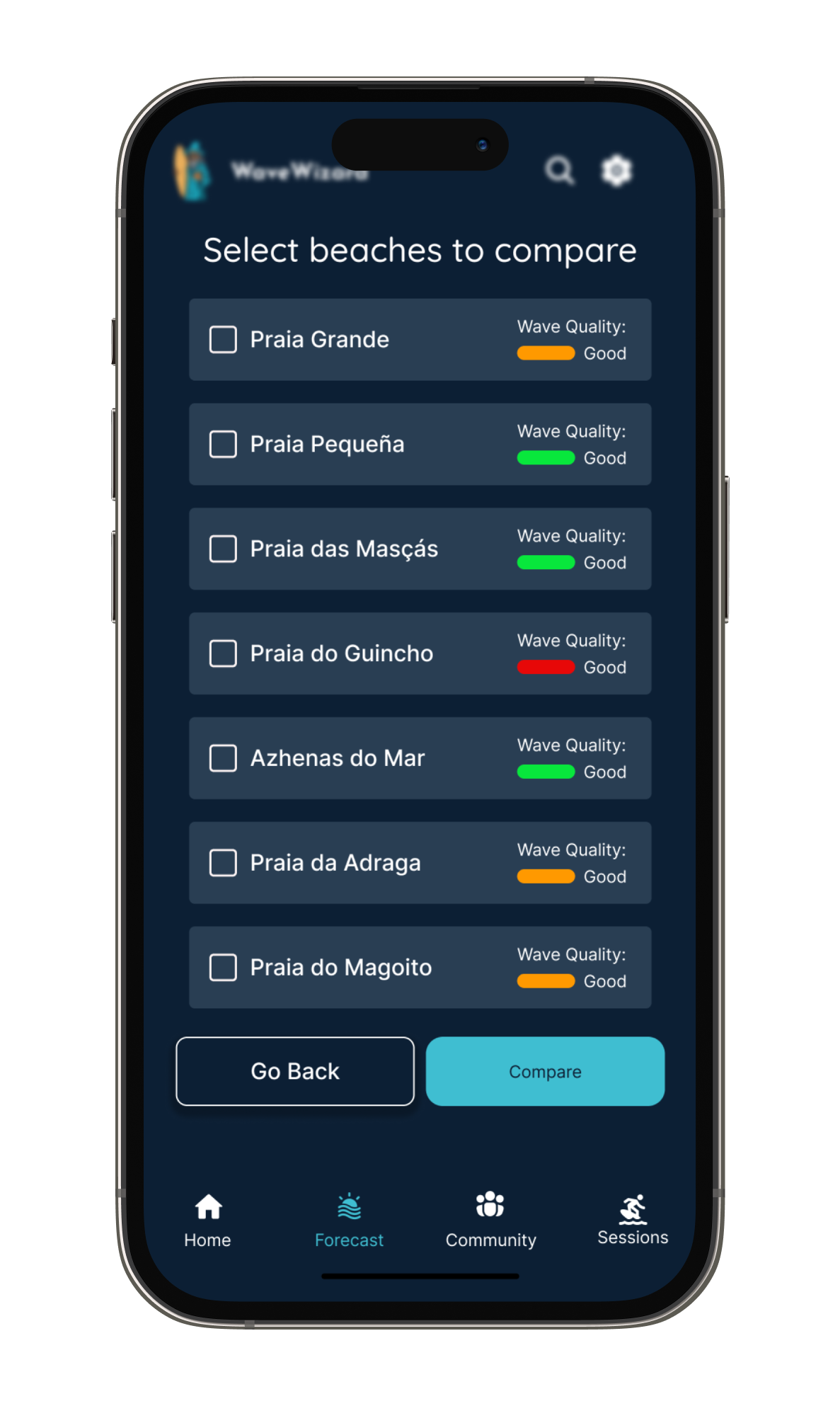
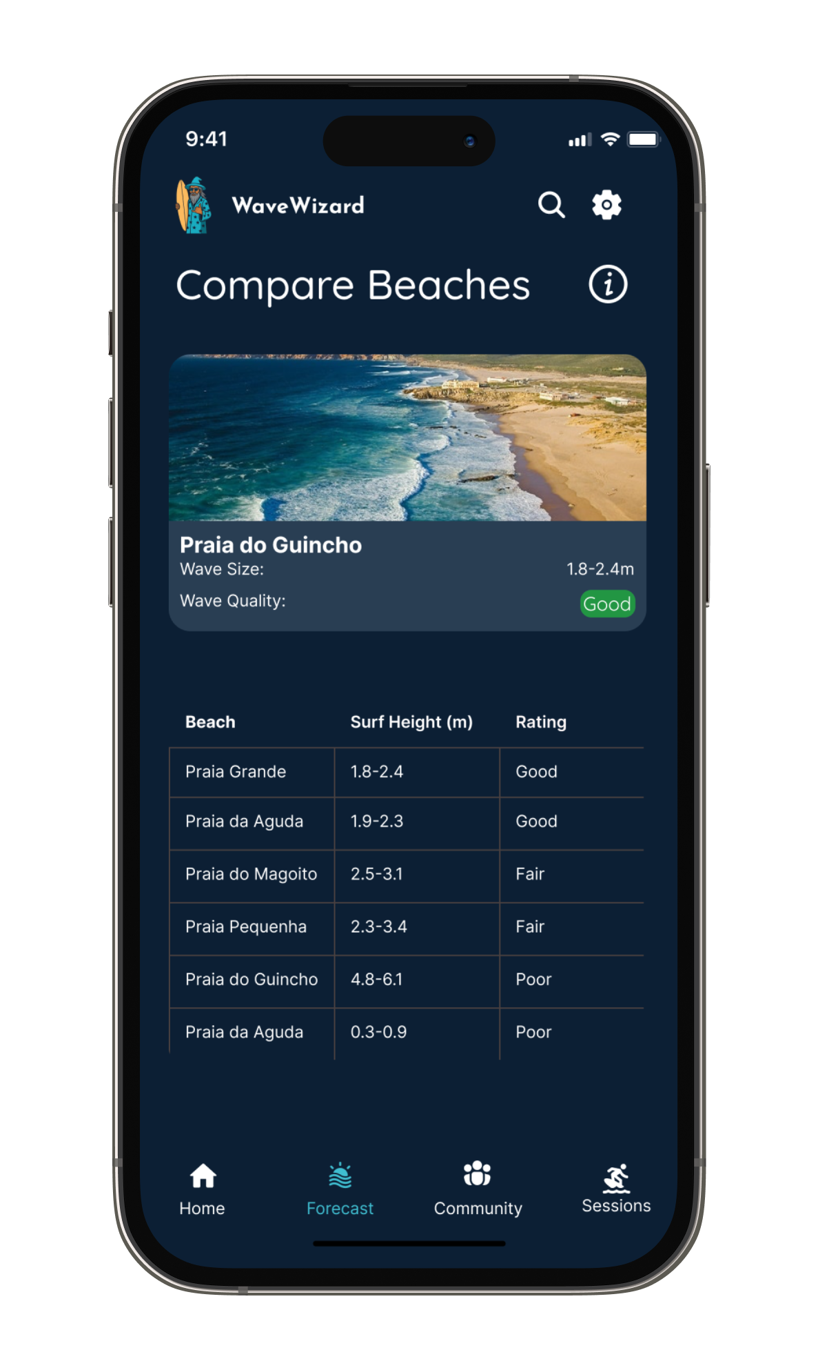
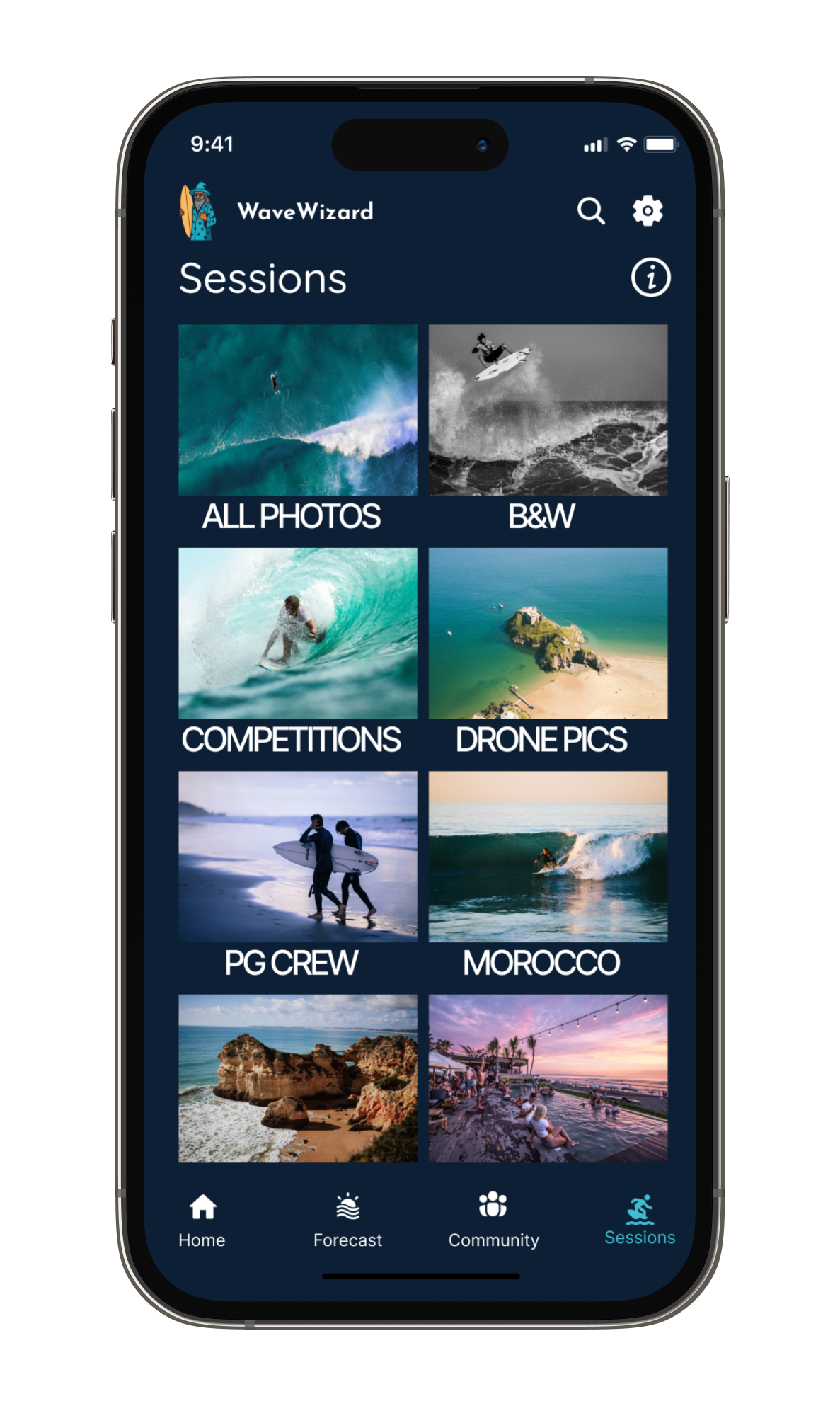
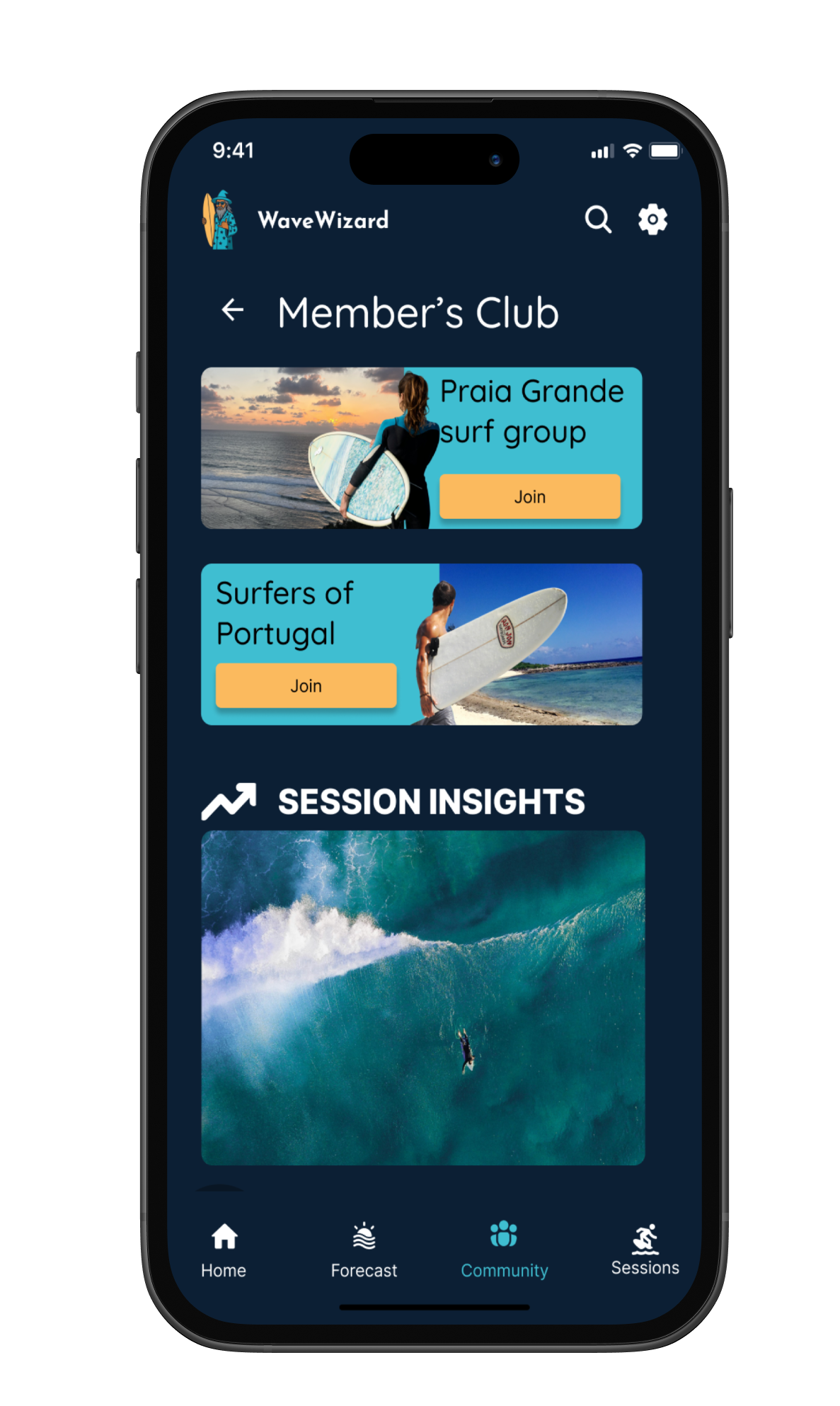
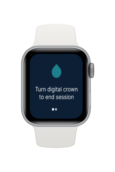
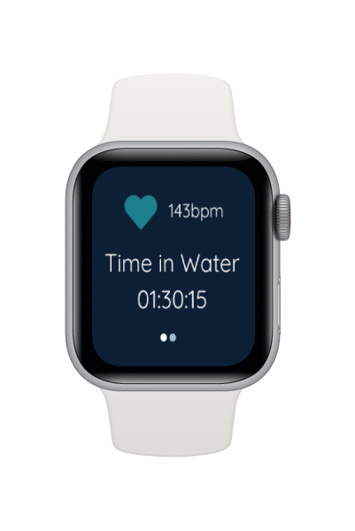
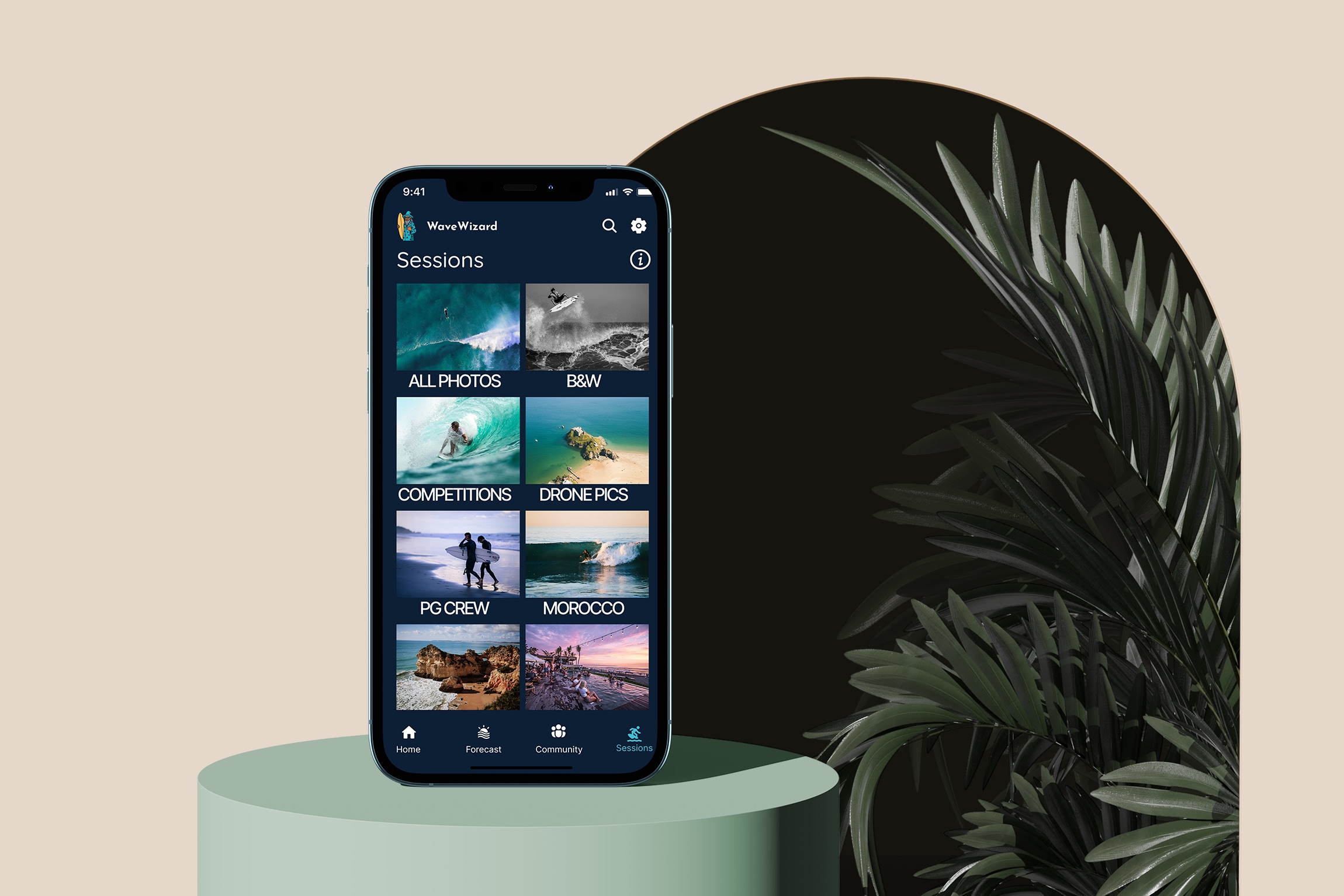
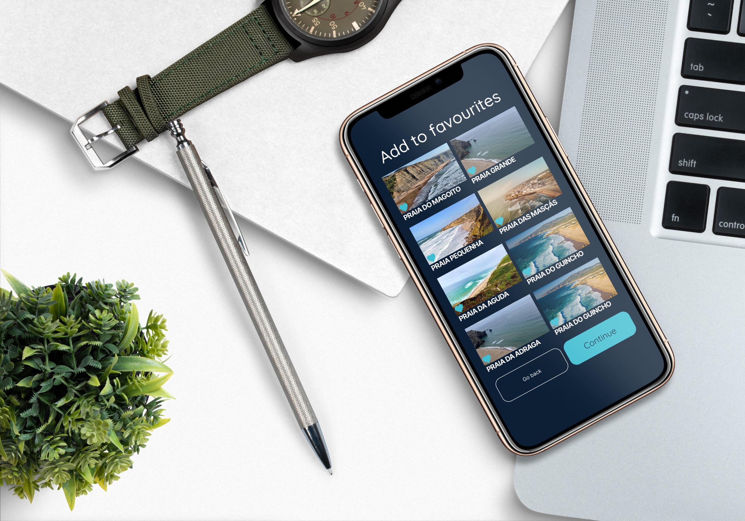
High-fidelity wireframes
Starting with low-fidelity sketches in Figma, I tested layout and information heirarchy before moving into higer fidelity. User testing led to multiple iterations focused on:
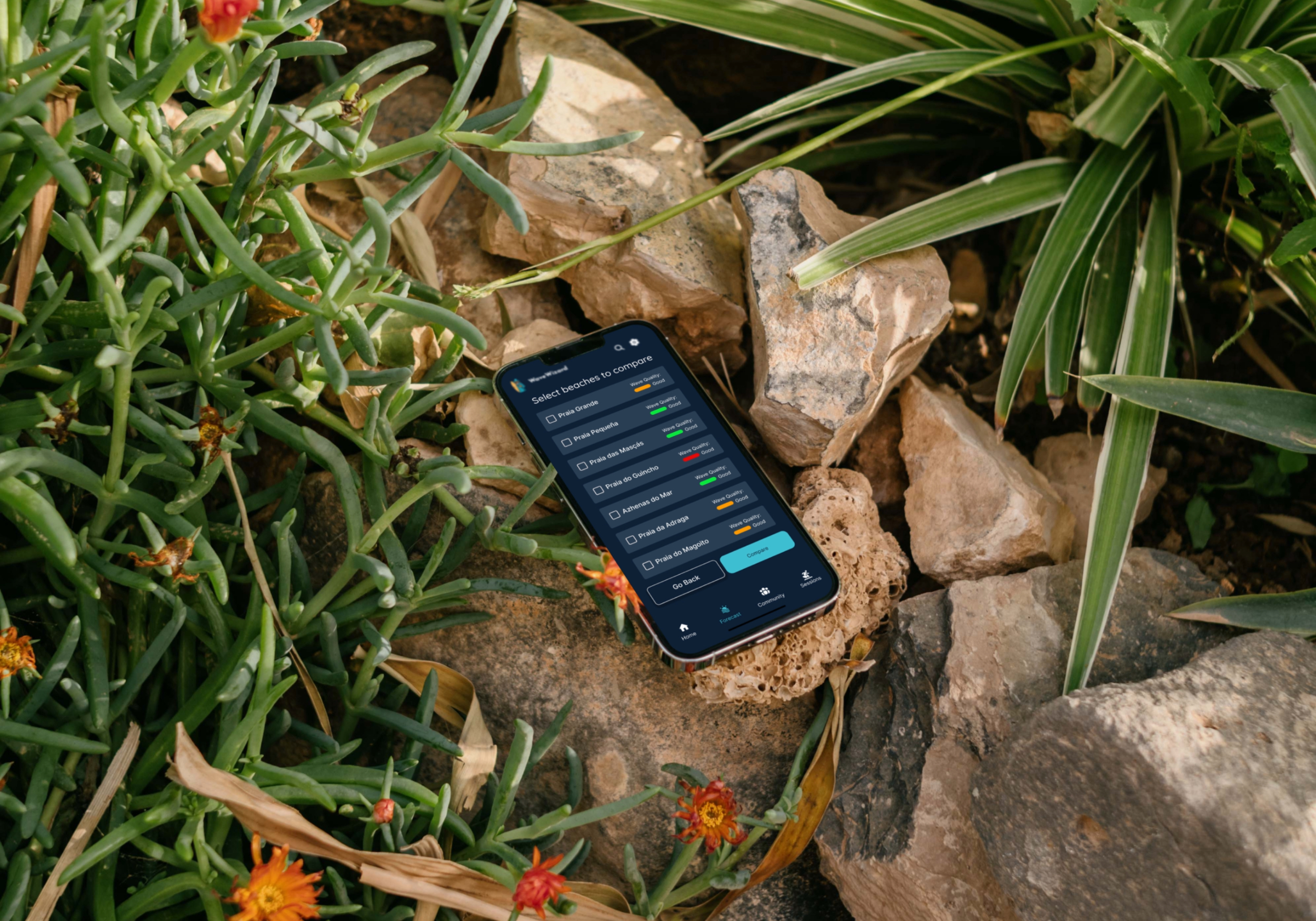
high-contrast UI for bright-light legibility and clean minimal navigation to reduce cognitive load, beginner mode and experienced mode for different user types. Numerous iterations led to the final results that target specific user pain points and requirements.

Reflection
Moving forward with design
The final designs reflect a process of iteration, testing, and refinement, ensuring each decision was tied to user needs and the overall goal of creating an engaging, motivating study experience.
Learnings
Wave Wizard taught me how to:
- Ground product decisions in user needs and real-world constraints.
- Balance simplicity with functionality—especially for data-heavy tools.
- Design for inclusivity, outdoor usage, and a spectrum of skill levels.
- Design with empathy, talking directly with users to ensure the product directly solves a real problem in a way that people can actually use and enjoy.
High-level plan for future iterations
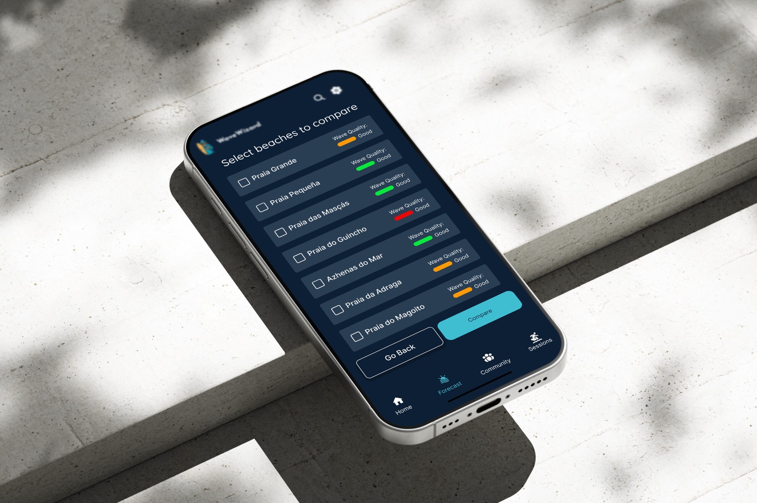
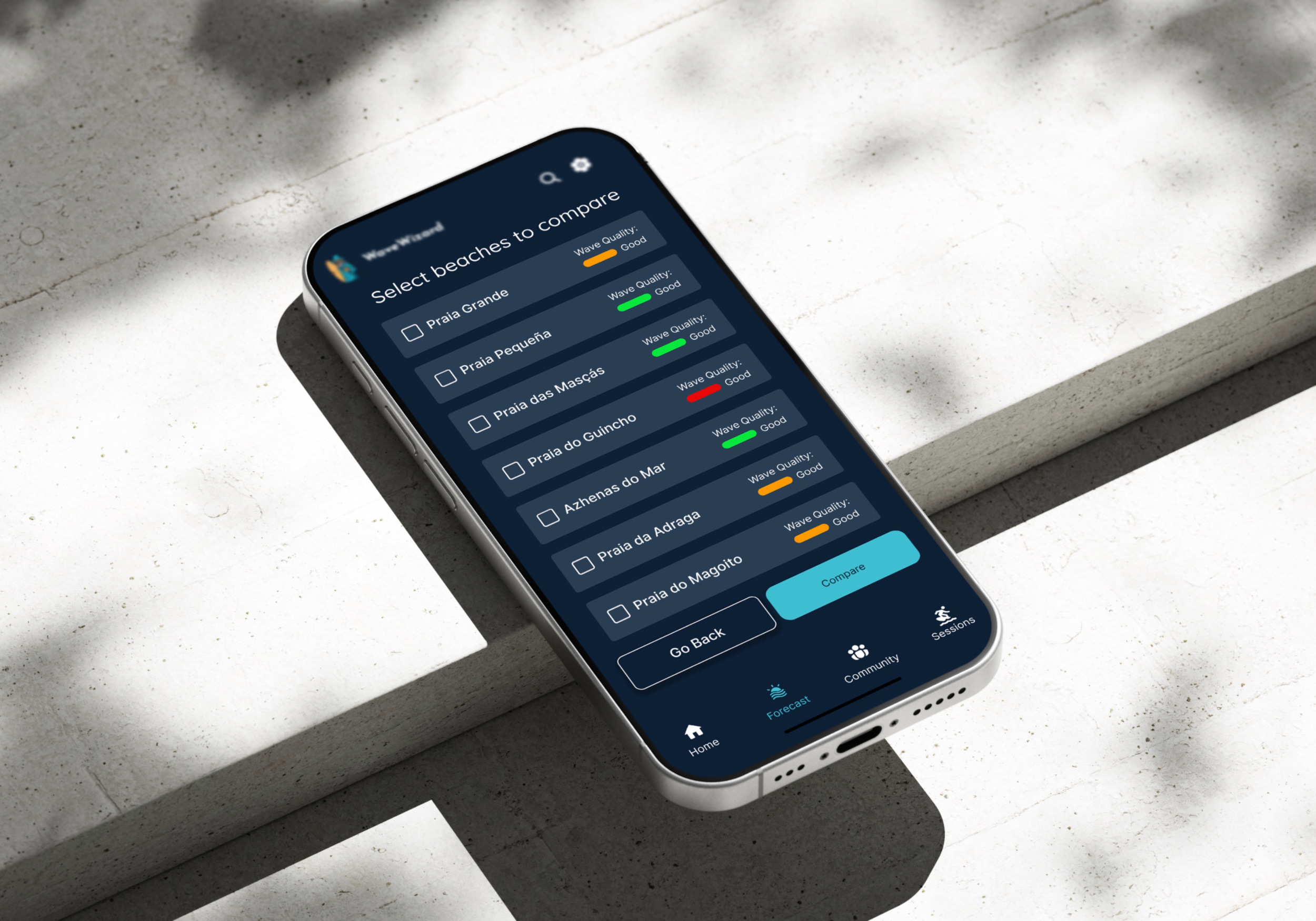
To continually improve WaveWizard I will further test the hypotheses: Users would like to be able to compare beaches within the app to receive a more enhaced experience, and users want more visually rich data information to make informed surfing decisions. In testing these hypotheses and conintually reviewing the app by monitoring app performance, gather ongoing user feedback, I wil be able to prioritise new features based on user demand and engagement trends.
Thanks for watching!
If you are interested in my work, please get in touch:
Selected Works